Button
本文档贡献者:sunnylqm(100.00%)
一个简单的跨平台的按钮组件。可以进行一些简单的定制。
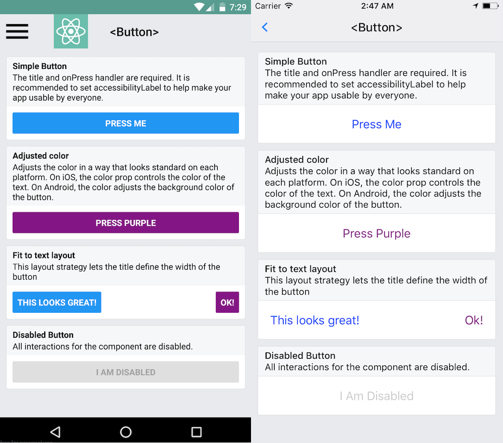
这个组件的样式是固定的。所以如果它的外观并不怎么搭配你的设计,那你需要使用TouchableOpacity或是TouchableNativeFeedback组件来定制自己所需要的按钮,视频教程如何制作一个按钮讲述了完整的过程。或者你也可以在 github.com 网站上搜索 'react native button' 来看看社区其他人的作品。
示例:
import { Button } from 'react-native';
...

<Button
  onPress={onPressLearnMore}
  title="Learn More"
  color="#841584"
  accessibilityLabel="Learn more about this purple button"
/>
查看 Props
文档
Props
onPress
用户点击此按钮时所调用的处理函数
| 类型 | 必填 |
|---|---|
| function | 是 |
title
按钮内显示的文本
| 类型 | 必填 |
|---|---|
| string | 是 |
accessibilityLabel
用于给残障人士显示的文本(比如读屏应用可能会读取这一内容)
| 类型 | 必填 |
|---|---|
| string | 否 |
color
文本的颜色(iOS),或是按钮的背景色(Android)
| 类型 | 必填 |
|---|---|
| color | 否 |
disabled
设置为 true 时此按钮将不可点击。
| 类型 | 必填 |
|---|---|
| bool | 否 |
testID
用来在端到端测试中定位此视图。
| 类型 | 必填 |
|---|---|
| string | 否 |
hasTVPreferredFocus
(Apple TV only) TV preferred focus (see documentation for the View component).
| 类型 | 必填 | 平台 |
|---|---|---|
| bool | 否 | iOS |