使用Flexbox布局
本文档贡献者:sunnylqm(98.94%), lijason1121(1.06%)
我们在 React Native 中使用 flexbox 规则来指定某个组件的子元素的布局。Flexbox 可以在不同屏幕尺寸上提供一致的布局结构。
一般来说,使用flexDirection、alignItems和 justifyContent三个样式属性就已经能满足大多数布局需求。
译注:这里有一份简易布局图解,可以给你一个大概的印象。
React Native 中的 Flexbox 的工作原理和 web 上的 CSS 基本一致,当然也存在少许差异。首先是默认值不同:
flexDirection的默认值是column而不是row,而flex也只能指定一个数字值。
Flex
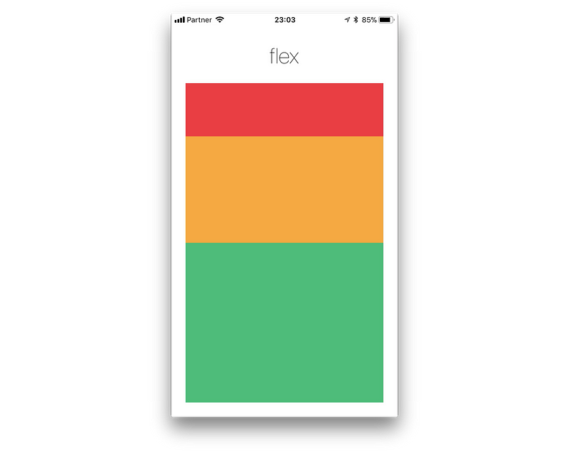
flex 属性决定元素在主轴上如何填满可用区域。整个区域会根据每个元素设置的flex属性值被分割成多个部分。
在下面的例子中,在设置了flex: 1的容器view中,有红色,黄色和绿色三个子view。红色view设置了flex: 1,黄色view设置了flex: 2,绿色view设置了flex: 3。1+2+3 = 6,这意味着红色view占据整个区域的1/6,黄色view占据整个区域的2/6,绿色view占据整个区域的3/6。
Flex Direction
在组件的style中指定flexDirection可以决定布局的主轴。子元素是应该沿着水平轴(row)方向排列,还是沿着竖直轴(column)方向排列呢?默认值是竖直轴(column)方向。
Layout Direction
Layout direction specifies the direction in which children and text in a hierarchy should be laid out. Layout direction also affects what edge start and end refer to. By default React Native lays out with LTR layout direction. In this mode start refers to left and end refers to right.
LTR(default value) Text and children and laid out from left to right. Margin and padding applied the start of an element are applied on the left side.RTLText and children and laid out from right to left. Margin and padding applied the start of an element are applied on the right side.
Justify Content
在组件的 style 中指定justifyContent可以决定其子元素沿着主轴的排列方式。子元素是应该靠近主轴的起始端还是末尾段分布呢?亦或应该均匀分布?对应的这些可选项有:flex-start、center、flex-end、space-around、space-between以及space-evenly。
Align Items
在组件的 style 中指定alignItems可以决定其子元素沿着次轴(与主轴垂直的轴,比如若主轴方向为row,则次轴方向为column)的排列方式。子元素是应该靠近次轴的起始端还是末尾段分布呢?亦或应该均匀分布?对应的这些可选项有:flex-start、center、flex-end以及stretch。
注意:要使
stretch选项生效的话,子元素在次轴方向上不能有固定的尺寸。以下面的代码为例:只有将子元素样式中的width: 50去掉之后,alignItems: 'stretch'才能生效。
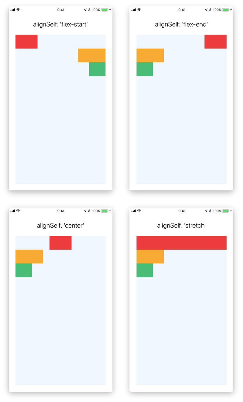
Align Self
alignSelf has the same options and effect as alignItems but instead of affecting the children within a container, you can apply this property to a single child to change its alignment within its parent. alignSelf overrides any option set by the parent with alignItems.
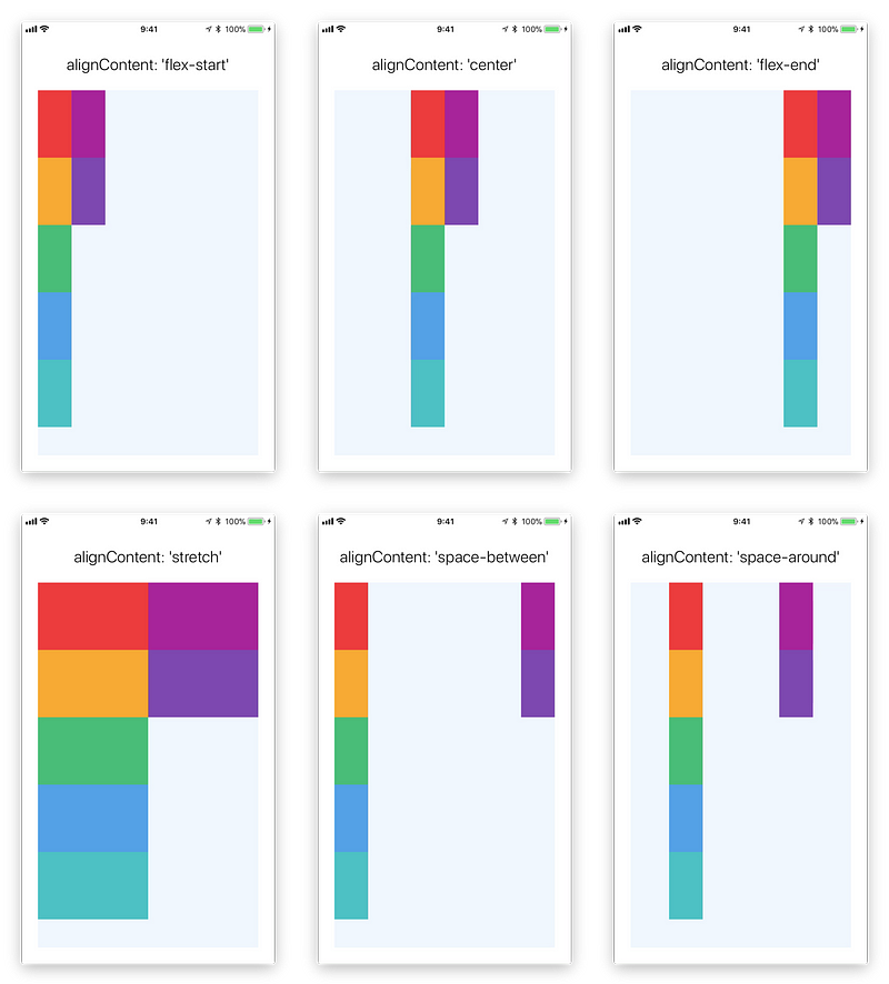
Align Content
alignContent defines the distribution of lines along the cross-axis. This only has effect when items are wrapped to multiple lines using flexWrap.
flex-start(default value) Align wrapped lines to the start of the container's cross axis.flex-endAlign wrapped lines to the end of the container's cross axis.stretchwrapped lines to match the height of the container's cross axis.centerAlign wrapped lines in the center of the container's cross axis.space-betweenEvenly space wrapped lines across the container's main axis, distributing remaining space between the lines.space-aroundEvenly space wrapped lines across the container's main axis, distributing remaining space around the lines. Compared to space between using space around will result in space being distributed to the begining of the first lines and end of the last line.space-evenlyEvenly distributed within the alignment container along the main axis. The spacing between each pair of adjacent items, the main-start edge and the first item, and the main-end edge and the last item, are all exactly the same.
LEARN MORE HERE
Flex Wrap
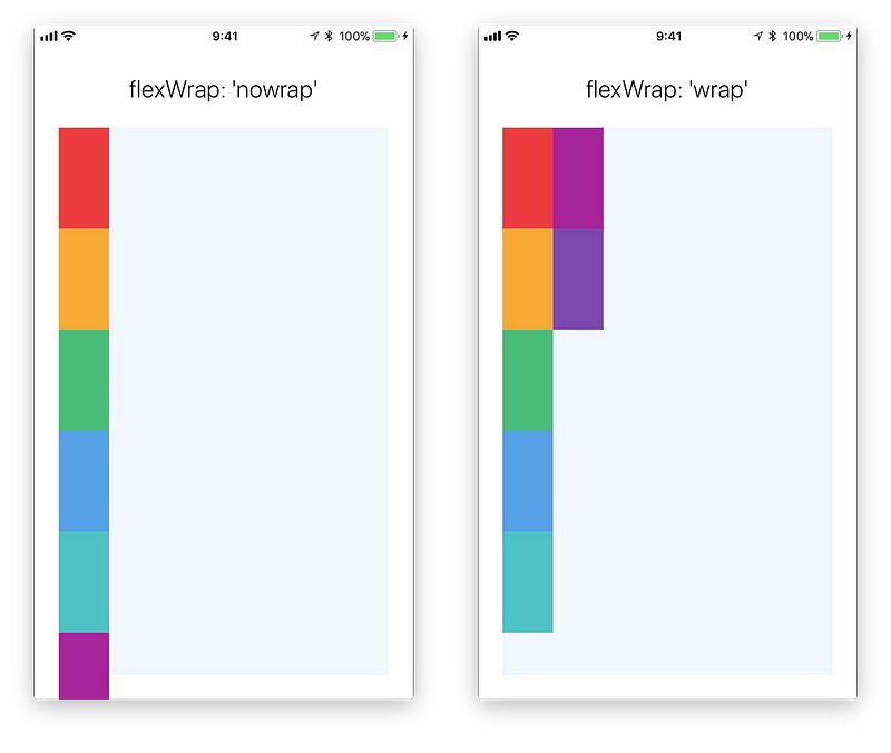
The flexWrap property is set on containers and controls what happens when children overflow the size of the container along the main axis. By default children are forced into a single line (which can shrink elements). If wrapping is allowed items are wrapped into multiple lines along the main axis if needed.
When wrapping lines alignContent can be used to specify how the lines are placed in the container. learn more here
Flex Basis, Grow, and Shrink
flexGrowdescribes how any space within a container should be distributed among its children along the main axis. After laying out its children, a container will distribute any remaining space according to the flex grow values specified by its children.flexGrow accepts any floating point value >= 0, with 0 being the default value. A container will distribute any remaining space among its children weighted by the child’s flex grow value.
flexShrinkdescribes how to shrink children along the main axis in the case that the total size of the children overflow the size of the container on the main axis. Flex shrink is very similar to flex grow and can be thought of in the same way if any overflowing size is considered to be negative remaining space. These two properties also work well together by allowing children to grow and shrink as needed.Flex shrink accepts any floating point value >= 0, with 1 being the default value. A container will shrink its children weighted by the child’s flex shrink value.
flexBasisis an axis-independent way of providing the default size of an item along the main axis. Setting the flex basis of a child is similar to setting thewidthof that child if its parent is a container withflexDirection: rowor setting theheightof a child if its parent is a container withflexDirection: column. The flex basis of an item is the default size of that item, the size of the item before any flex grow and flex shrink calculations are performed.
LEARN MORE HERE
Width and Height
The width property in Yoga specifies the width of the element's content area. Similarly height property specifies the height of the element's content area.
Both width and height can take following values:
autoIs the default Value, React Native calculates the width/height for the element based on its content, whether that is other children, text, or an image.pixelsDefines the width/height in absolute pixels. Depending on other styles set on the component, this may or may not be the final dimension of the node.percentageDefines the width or height in percentage of its parent's width or height respectively.
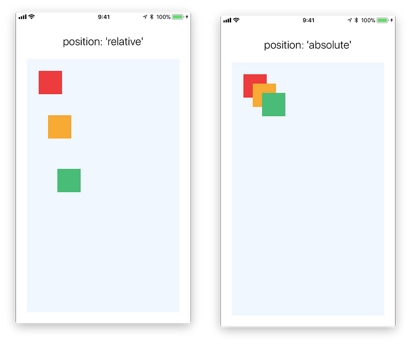
Absolute & Relative Layout
The position type of an element defines how it is positioned within its parent.
relative (default value) By default an element is positioned relatively. This means an element is positioned according to the normal flow of the layout, and then offset relative to that position based on the values of top, right, bottom, and left. The offset does not affect the position of any sibling or parent elements.
absolute When positioned absolutely an element doesn't take part in the normal layout flow. It is instead laid out independent of its siblings. The position is determined based on the top, right, bottom, and left values.
深入学习
Check out the interactive yoga playground that you can use to get a better understanding of flexbox.
以上我们已经介绍了一些基础知识,但要运用好布局,我们还需要很多其他的样式。对于布局有影响的完整样式列表记录在这篇文档中。
现在我们已经差不多可以开始真正的开发工作了。哦,忘了还有个常用的知识点:如何使用 TextInput 组件来处理用户输入。